

When it comes to colors, it’s reasonable to wonder whether they evolve or are created. It might be a balance of both, according to Caroline Guilbert, Head of Creative Content for Coloro. The WGSN Color of the Year selection process, which the organization undertakes with Coloro, typically starts about two years in advance, and predicting the next hot hues is a never-ending job. Every season, the global forecasting company’s experts choose colors for their periodic and annual forecasts from Coloro’s extensive library of 3,500+ contemporary colors.
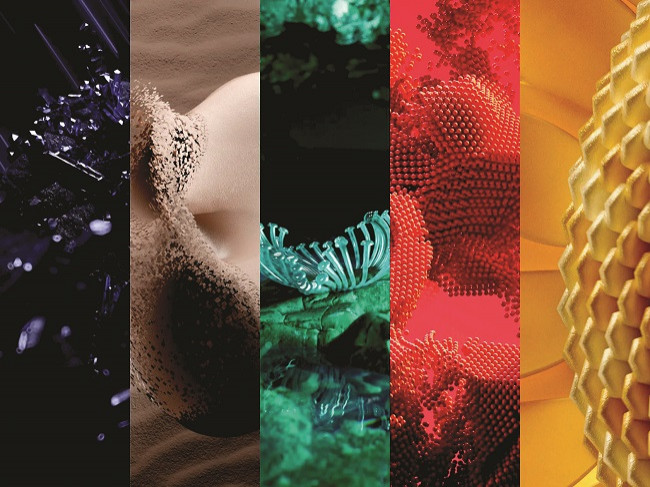
Figure: The WGSN Color of the Year selection process, which the organization undertakes with Coloro. Courtesy: Collected
The team begins by choosing all the upcoming seasonal colors, before honing in on the key colors for the target year. By the time those key colors are selected, forecasters can usually identify a standout color that has proven most versatile and most complementary to each of the key colors. That hue is also adaptable between industries.
The deep violet-blue of 2025’s Future Dusk is a romantic twilight shade, representing a “period of immense change” according to WGSN. It aligns with our increasing passion for space exploration and the growing industry around space tourism, the metaverse and asteroid mining.
In Future Dusk’s immersive richness, there is ready potential for versatile application. Expect to see it in everything from luxury jewelry to dress fabrics, suits, shoes, stationery and—in the residential sphere—interior paint, decor and floor coverings.
The full Spring/Summer 2025 color palette favors cool blues and violets, appended by vibrant coral red and sunflower yellow. Each color that makes it into the annual palette has a story behind it.
Urangoo Samba, Head of Color for WGSN, explained that the collaborative selection process is an intensive one. This makes sense, given how broadly the chosen hues impact the design of consumer goods from eyeshadows to socks to car seats to tissue packaging.
“All of the WGSN and Coloro key forecasters from various regions across the world—in interiors, womenswear, menswear, youth, active, consumer tech and beauty—get together at a workshop to present research and findings,” Samba told Observer. While each shade is selected independently, the final range of shades must be cohesive as a palette.
“The colors in the seasonal palette are chosen with attention to how they work in head-to-toe styling, key seasonal color stories and unique color combinations,” she added.
It’s complex work and surprisingly strategic. The Global Colour Forecast aligns with a framework that incorporates drivers, innovations and behaviors into an analysis that looks at trends in society, technology, the environment, industry, creativity and even politics.
Colors on tap
Transcendent Pink is a subtle, near-neutral between violet, beige and pink. There’s a gentleness to its dusty color, which is already being seen in virtual worlds and soft A.I., such as the digital spaces created by metaverse company Pax.world and architecture studios Grimshaw, Farshid Moussavi, HWKN and WHY, which are inspired by roadside inns along the ancient Silk Road.
Aquatic Awe is a turquoise that straddles the oceanic vastness while also looking synthetic and unreal, harking to ideas of AI-created artwork and bio-synthetic creations derived from nature combined with scientifically created materials.
Sunset Coral is a highly saturated orange that contrasts brilliantly with both aqua and pale pink, partnering well with Ray Flower, a radiant, warm yellow. The growing use of sunflowers as a single source for materials production that can result in everything from cellulose for textiles to pigments for dyes. In its sunniness, it acts as a foil for Future Dusk, with moon and sun both represented.
Why is the Color of the Year important?
Pantone first introduced its Color of the Year in 2000. Since 2010, forecasting the Color of the Year has become a staple occupation of many consumer and design companies.
More than a fun exercise in spinning the color wheel, color trend forecasting has major economic ramifications for companies that craft consumer goods. These colors will guide available materials and consumer demand if the expert research and analysis are on point.
“The fashion industry tends to consider these insights one year to a year and a half in advance,” Guilbert says. “The interiors sector works at a slightly slower pace than fashion trends.” Meanwhile, activewear and footwear brands may work two years in advance, since many of them have to balance looks and innovation. “They are usually ahead of the curve on these trends if they are not the ones creating them.”
It’s not just about being first to market. Brands increasingly need to mine social and cultural clues for the mood of the consumer and to ascertain what they want before they even realize it themselves to stay competitive. Shape, texture and price play into buying decisions, but so does color—more so than the average consumer may realize.
“Color is everywhere and it is the first thing we register when assessing anything,” explains Guilbert. “It is increasingly becoming a differentiator and driver of growth and sustainability for brands.”
In fact, color is often the leading factor in the decision to purchase a product.” Reiko Morrison, Head of Color, Material, Finish (CMF) at WGSN Consumer Tech, pointed out last year that “70-90% of consumers say color alone is a primary reason for purchasing a product”—particularly when shopping for smaller tech devices such as phones, wearables and portables.
The economic benefits for brands that design their products according to color trends are manifold. And more organizations have realized that it’s much more convenient to look toward global color authorities for insights than to conduct research in-house.
“It is a more economically conscious approach to design and increases the success of the products that will be available on the market,” Guilbert says. “It avoids the production of items that would not appeal, create unsold stock and ultimately go to waste. “
When WGSN’s international team of expert forecasters convenes annually, they consider everything from analyses of regional social movements and global events to what’s hot at art and design exhibitions to the input of tastemakers and influencers to product trends. To confirm that their forecast trends have indeed been on the money (literally), WGSN uses AI and image recognition technology to capture color data from millions of images on social media and map it to color codes, enabling an in-depth trend analysis. WGSN also looks at new products, markdowns and out-of-stocks, enabling analysis of color trends at the retail level.
Guilbert describes 2025’s Color of the Year, Future Dusk, as “surreal and otherworldly… giving it a celestial quality. It feels both familiar and futuristic and is also linked to the rise of the metaverse and AI, representing an inspiration to build new worlds.”
Samba is more enamored with the Color of the Year 2024: Apricot Crush, a vivid counter to the deep, gothic qualities of Future Dusk. She describes the fruity, vivid shade as “restorative, refreshing and energetic… which is perfect as we grapple with a range of emotions and uneasiness about the future.”